A mobile app prototype that helps busy people decide what to cook using ingredients they already have. QuickBite combines ingredient tracking, fridge scanning, recipe suggestions, substitutions, and an expiring-food Rescue Mode to reduce stress, save time, and limit waste.
Users have ingredients, but don't know what to cook with them.
§ 01 — Problem
What are users actually searching for?
The deeper problem isn't recipes — it's quick decisions under fatigue.
We began with the broad question of how people cook and manage meals at home. Through five rounds of problem narrowing, we re-framed a vague pain point into a specific design problem: many users have ingredients at home but still struggle to quickly decide what to make. The result is stress, skipped meals, takeout, and food that quietly expires in the fridge.
This problem is especially common for students, full-time workers, beginner cooks, and busy households because they often face limited time, inconsistent routines, and varying access to kitchen resources. Existing tools partially address the issue, but they often focus on browsing recipes, building weekly meal plans, or manually entering full pantry lists rather than helping users make a fast, realistic decision in the moment.
01
Cooking at home is hard
Broad: people struggle with meals across the week.
02
Decisions, not recipes, are the bottleneck
Most users don't lack ideas — they lack the energy to pick one.
03
Decisions happen in the moment
Planning ahead is rare. Real cooking starts when someone is already hungry.
04
Context constrains the answer
Time, skill, equipment, dietary needs, and what's already on hand all matter.
05
Ingredients are the truest starting point
What you have is more honest than what you plan.
Design Question · How might we…
How might we design a tool that helps busy individuals quickly discover simple meal options based on the ingredients they already have, so they can reduce stress, save time, and make better use of food at home?
Existing recipe apps assume the user wants to browse or plan ahead. Our research showed users often need support in the moment: "I'm tired, I have random ingredients, what can I realistically make right now?" That single sentence became the design north star.
§ 02 — Research
Search results from real users
Anonymous surveys, literature review, and an affinity synthesis.
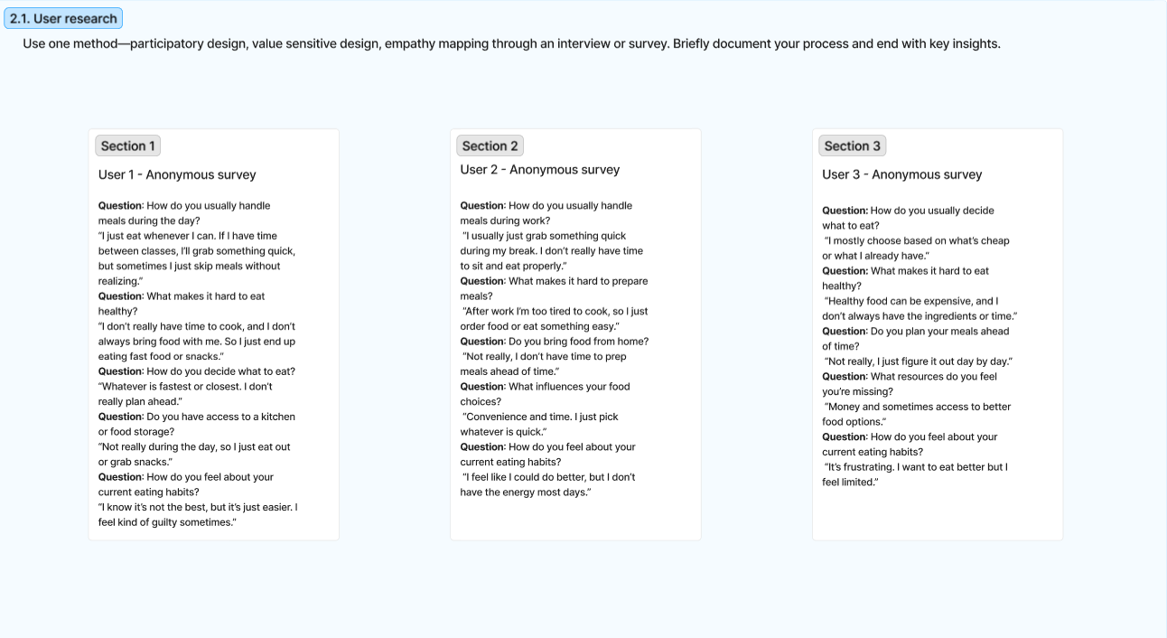
We ran an anonymous survey method with three primary participants and supplemented it with literature on home cooking, food insecurity, and the emotional weight of meal decisions. Below are three insights that reframed the problem and pulled us away from "build another recipe app."
U1
User 1
Student · Anonymous survey
"I just eat whenever I can. If I have time between classes, I'll grab something quick, but sometimes I just skip meals without realizing."
Insight · Users are short on time
U2
User 2
Full-time worker · Anonymous survey
"After work I'm too tired to cook, so I just order food or eat something easy. I usually pick whatever is quick."
Insight · Decision fatigue is the real cost
U3
User 3
Beginner cook · Anonymous survey
"Healthy food can be expensive, and I don't always have the ingredients or time. I just figure it out day by day."
Insight · Realistic constraints matter
Anonymous survey responses, full text. Three users described how they actually handle meals during a normal day — short windows, limited energy, and decisions made on the fly.
Affinity synthesis
Clustering the survey responses surfaced three pressure systems that any solution would have to respect.
Time pressure
"Whatever is fastest or closest."
Work breaks too short to sit and eat.
Day-by-day, not week-by-week.
Decision fatigue
Tired after work → defaults to takeout.
Recipe sites feel overwhelming.
"I want to eat better, but I feel limited."
Realistic constraints
Healthy food can be expensive.
Inconsistent kitchen / equipment access.
Beginner cooks need step-by-step guidance.
Supporting literature
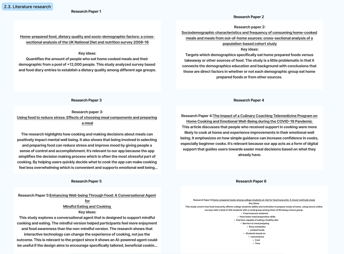
Six academic sources grounded what we heard from users in broader patterns — dietary quality, food insecurity, and the emotional benefits of guided cooking.
Literature review. Cooking at home correlates with better diet quality and lower stress when paired with guidance. Beginner cooks gain confidence from simple, supported instructions — a direct argument for QuickBite's match-percentage and substitution UI.
The research arc was unambiguous: the design challenge is not giving users more options. It is helping them narrow options based on real-world constraints — time, energy, ingredients on hand, cooking skill, dietary needs, equipment, and what is about to expire.
§ 03 — Competitive analysis
What existing tools missed
Three competitors, the same gap.
SuperCook
Recipe database
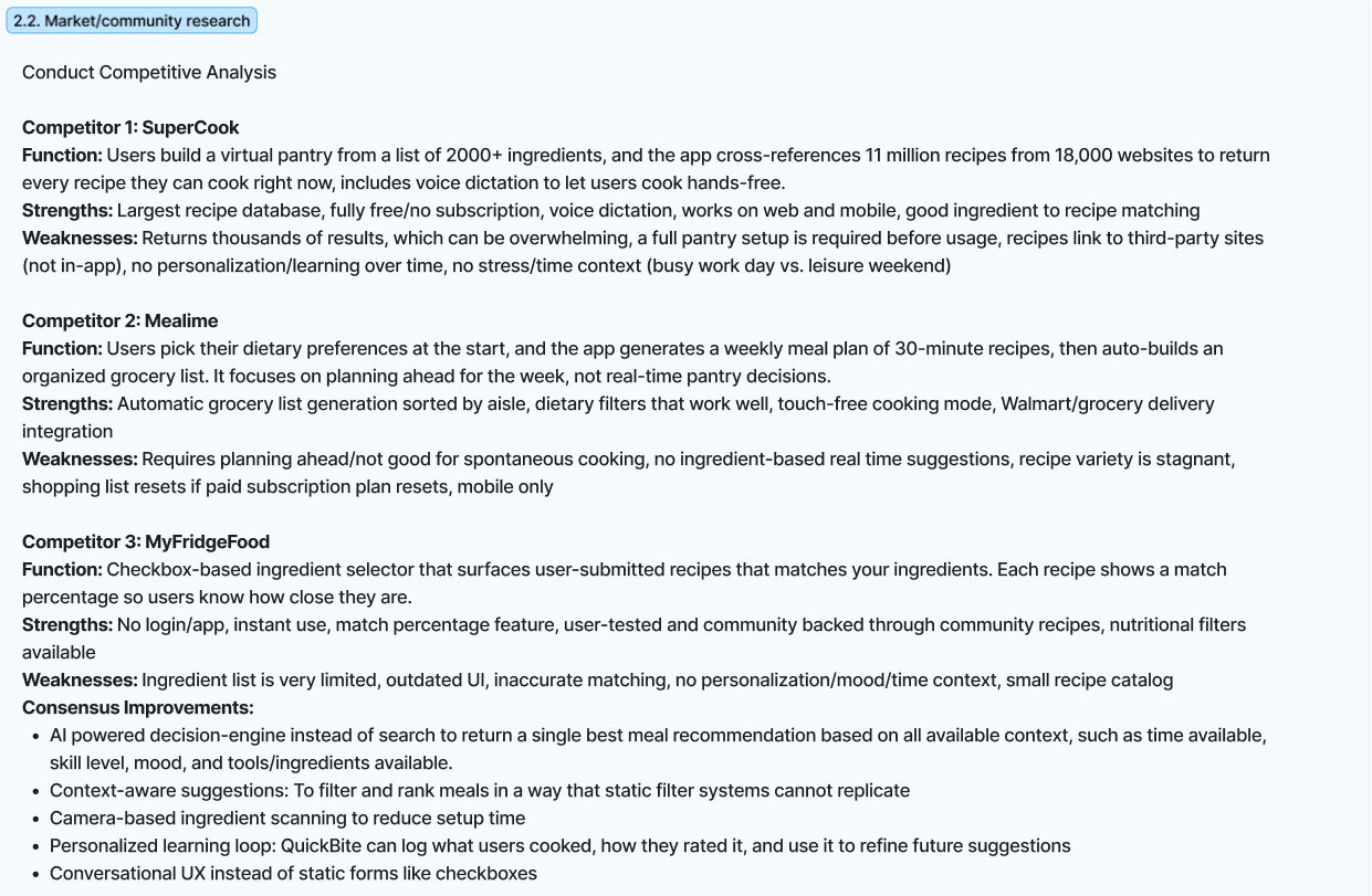
Huge ingredient-based recipe database (11M recipes from 18,000 sources).
Returns thousands of results, requires full pantry setup before usage, links out to third-party sites, no learning over time, no time / mood context.
Mealime
Weekly meal planning
Strong weekly planning, auto-built grocery lists sorted by aisle, dietary filters that work well.
Built for planning ahead, not for spontaneous "what can I make now" decisions. Variety stagnates. Shopping list resets on subscription lapse. Mobile only.
MyFridgeFood
Match-percentage selector
Simple ingredient checkboxes, instant use without login, recipes show match percentage.
Outdated UI, inaccurate matching, limited catalog, no personalization, no mood / time / equipment context.
Opportunity
QuickBite shouldn't be another recipe database. It should be a context-aware decision assistant — one that helps users choose realistic meals based on what they have, what is expiring, and what they are capable of cooking right now.
Competitive landscape, full breakdown. The consensus improvements column became QuickBite's product brief: AI-powered decision engine, context-aware ranking, camera-based scanning, personalized learning loop, conversational UX.
§ 04 — Stakeholders
Who are we designing for?
Direct users and the larger systems they sit inside.
Direct users
Students balancing class schedules, inconsistent meal windows, and tight budgets
Busy professionals cooking after long work days, often tired
Parents and caregivers feeding families with limited prep time
Beginner cooks who want guidance, not improvisation
Indirect stakeholders
Grocery stores and meal-kit services interested in retention and basket size
Communities promoting healthier home cooking and dietary literacy
Designers and developers extending the ecosystem (skill plugins, smart kitchens)
Sustainability advocates focused on household food waste
J
Jeff · 20
College student · cooks 2–3× / week
Lives with two roommates. Cooks when he has energy but skips meals between classes. Already owns ingredients he forgets about. Wants one button that says "you can actually make this tonight."
D
Daniel · 38
Grocery store manager · indirect stakeholder
Cares about household-level food waste because it shapes purchasing behavior. Sees QuickBite as a way to keep customers cooking — and therefore returning — instead of giving up and ordering delivery.
Because direct users had limited time, inconsistent schedules, and varying cooking confidence, QuickBite had to be fast, low-friction, and beginner-friendly. Because indirect stakeholders cared about healthier eating and waste reduction, we layered in pantry tracking, Rescue Mode, and long-term impact statistics.
§ 05 — Feature prioritization
From all possible features to the right features
An impact × feasibility matrix forced a tradeoff.
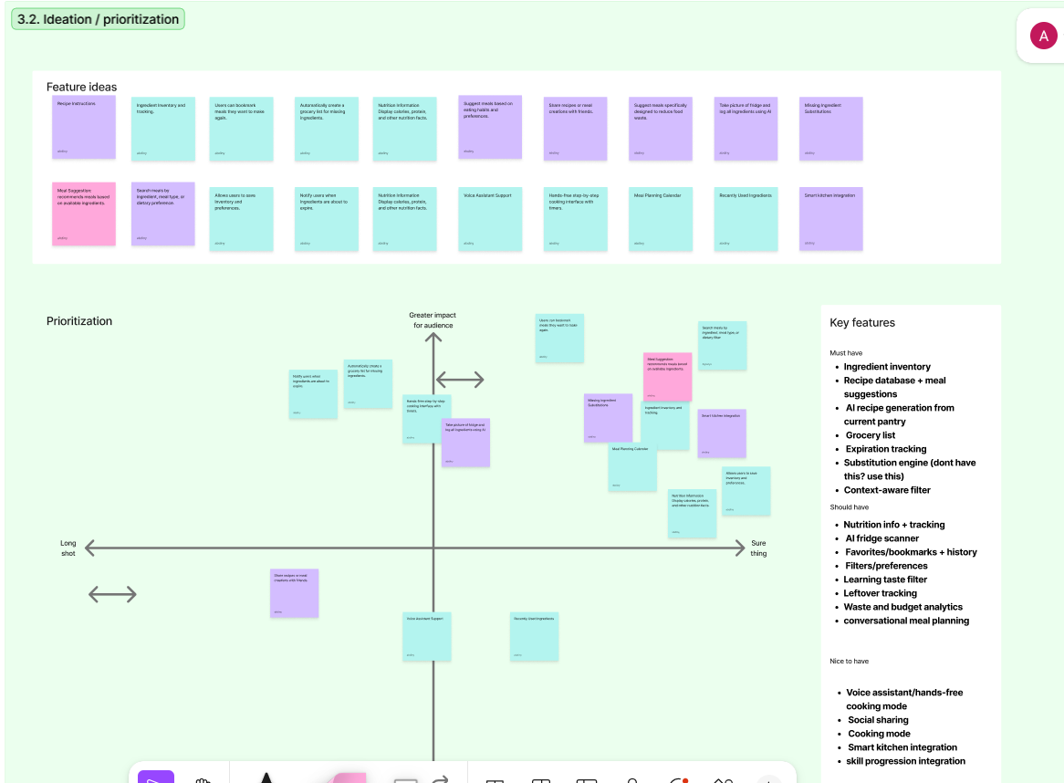
We brainstormed roughly twenty features ranging from voice control to smart-kitchen integration. Plotting them against impact and feasibility kept us from building a bloated app. The cut: only ship what directly serves the design question.
Must have
7
Ingredient inventory
Recipe database + meal suggestions
AI recipe generation from current pantry
Grocery list
Expiration tracking
Substitution engine
Context-aware filter
Should have
8
Nutrition info + tracking
AI fridge scanner
Favorites, bookmarks, history
Filters / preferences
Learning taste filter
Leftover tracking
Waste & budget analytics
Conversational meal planning
Nice to have
5
Voice assistant / hands-free
Social sharing
Smart kitchen integration
Cooking mode
Skill progression
Ideation board and prioritization matrix. Features were plotted against audience impact (vertical) and feasibility (horizontal). High-impact, high-feasibility items became the must-haves; high-impact but harder ones became should-haves; low-feasibility novelty features were deferred.
The matrix made one important tradeoff explicit: we wanted QuickBite to feel intelligent and complete, but the core experience had to stay simple. Features like social sharing and smart-kitchen integration were deferred not because they're bad ideas, but because they did not solve the in-the-moment decision problem.
§ 06 — Direction
Value proposition + solution approach
The bridge from research to design.
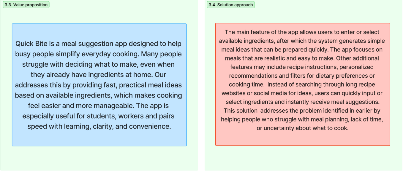
Locked-in direction. The value proposition (left) and solution approach (right) became the working brief. Speed, clarity, and convenience were chosen over comprehensiveness.
§ 07 — Low-fidelity prototype
Testing the basic flow
Before the polish, the structure.
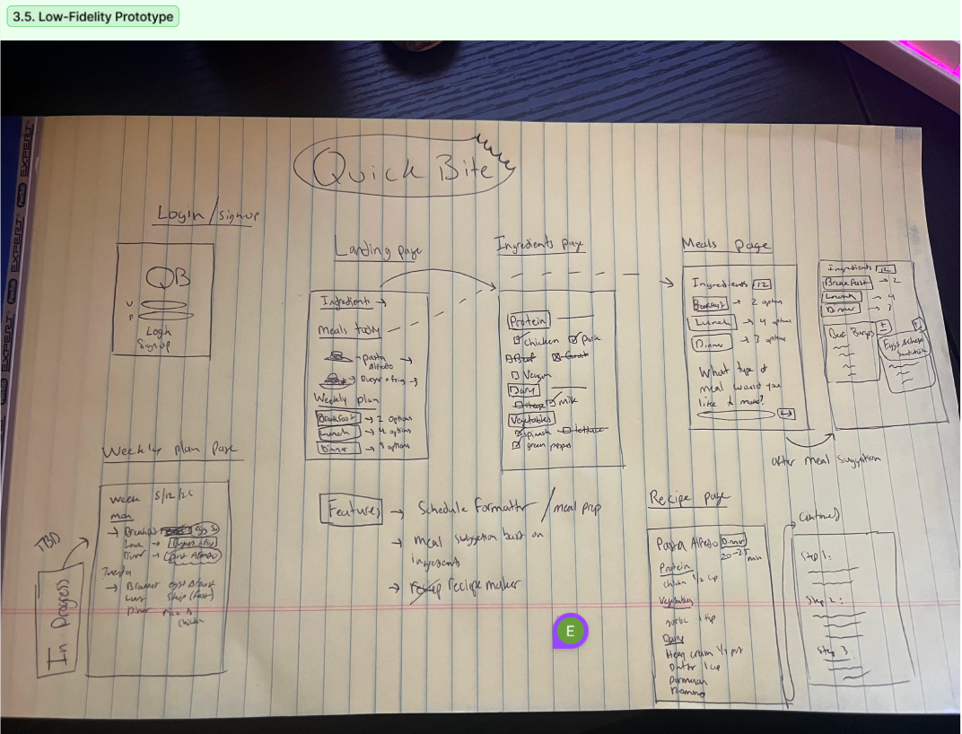
The first prototype was hand-sketched: login, landing, ingredient entry, meal suggestions, recipe page, weekly plan, and cooking steps. At this stage QuickBite was still closer to a general meal-planning product. The sketches' job wasn't beauty — it was finding which screens earned their place.
Original low-fidelity prototype. This sketch mapped the early QuickBite flow, including ingredient input, meal suggestions, recipe details, weekly planning, and cooking steps. It helped us test the structure before moving into higher-fidelity interface design.
After this round and the next wave of research, the app narrowed. The cooking-mode and weekly-plan screens stepped back. Scanning, pantry tracking, and quick decisions stepped forward. By the time we moved to high-fidelity, QuickBite was no longer "a recipe app with a pantry feature" — it was a pantry-first decision tool that happened to surface recipes.
§ 08 — Design solution
The QuickBite answer page
Five flows that map back to the design question.
The final prototype is organized around five flows. Each flow corresponds to a constraint surfaced during research — personalization, ingredient capture, recommendation, waste reduction, and ongoing support.
A.
Personalization flow
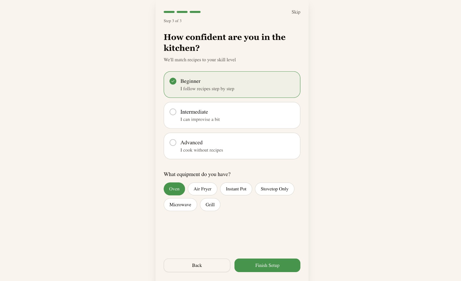
QuickBite begins by collecting constraints so recommendations are never generic. Dietary preferences, allergies, cooking confidence, and available equipment all change what counts as a realistic meal.
Skill + equipmentA beginner with only a stovetop should never see a recipe that assumes an air fryer.
B.
Ingredient capture flow
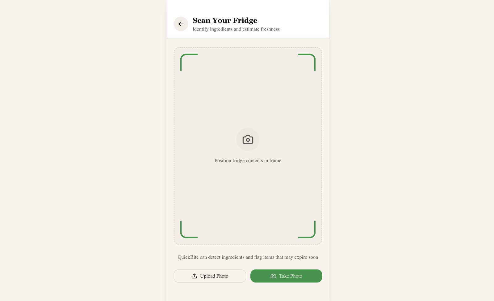
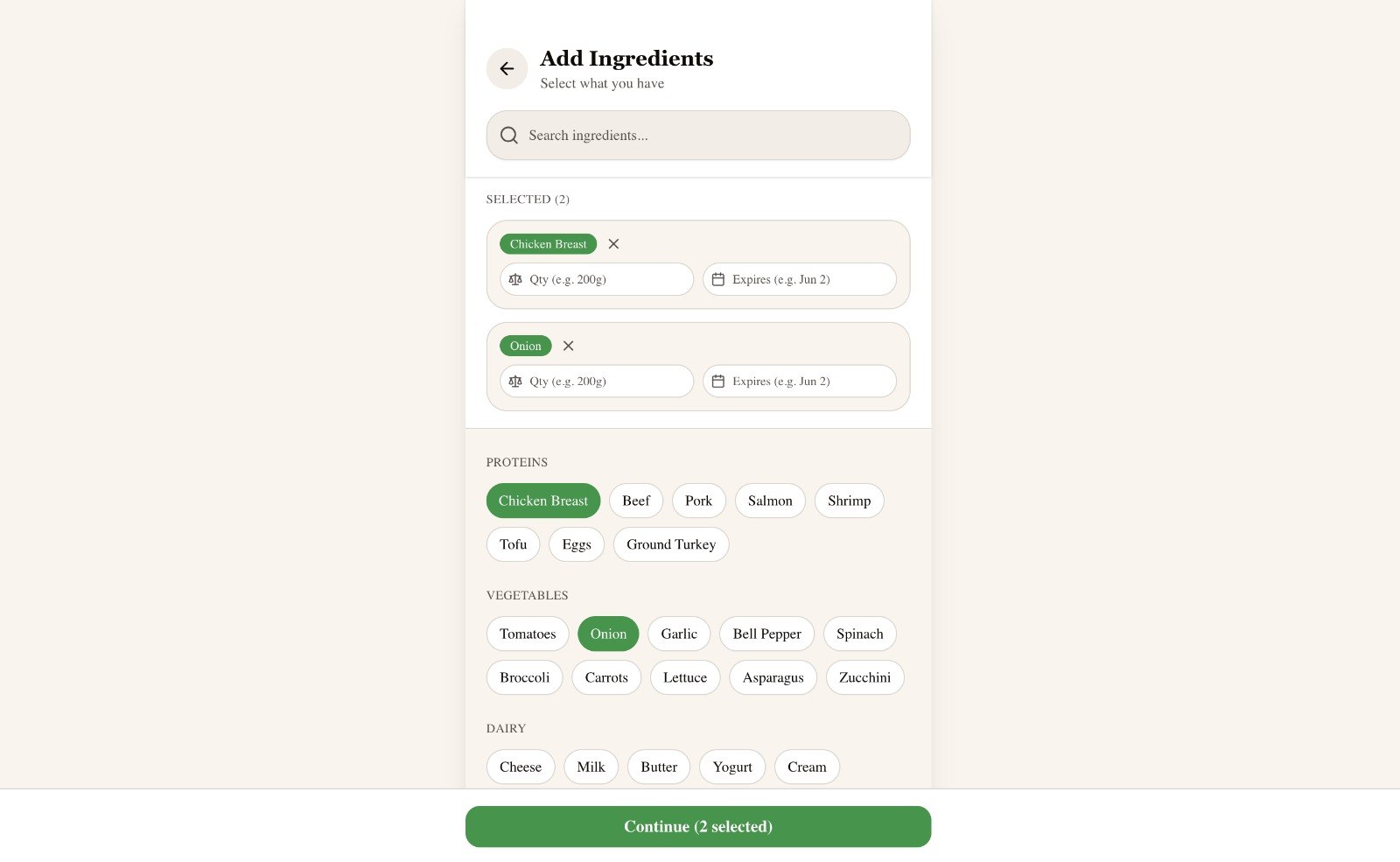
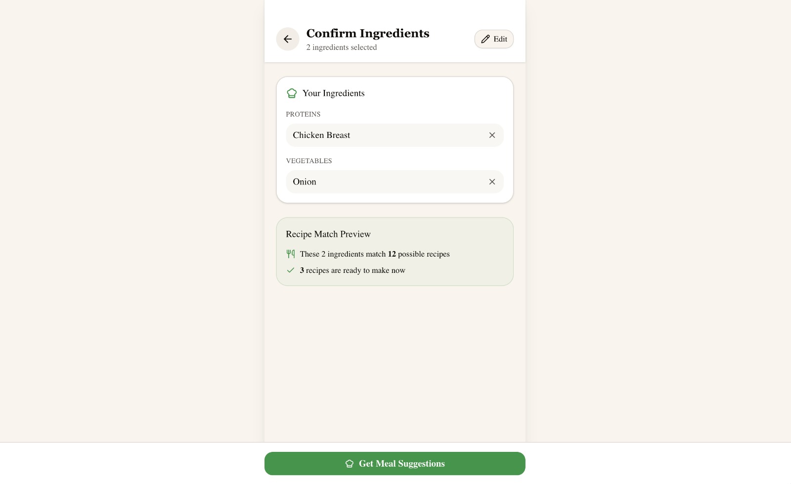
Typing every item is tedious, so QuickBite supports fridge scanning. But automated detection can be wrong — the scan review and confirm screens give users explicit control, which builds trust.
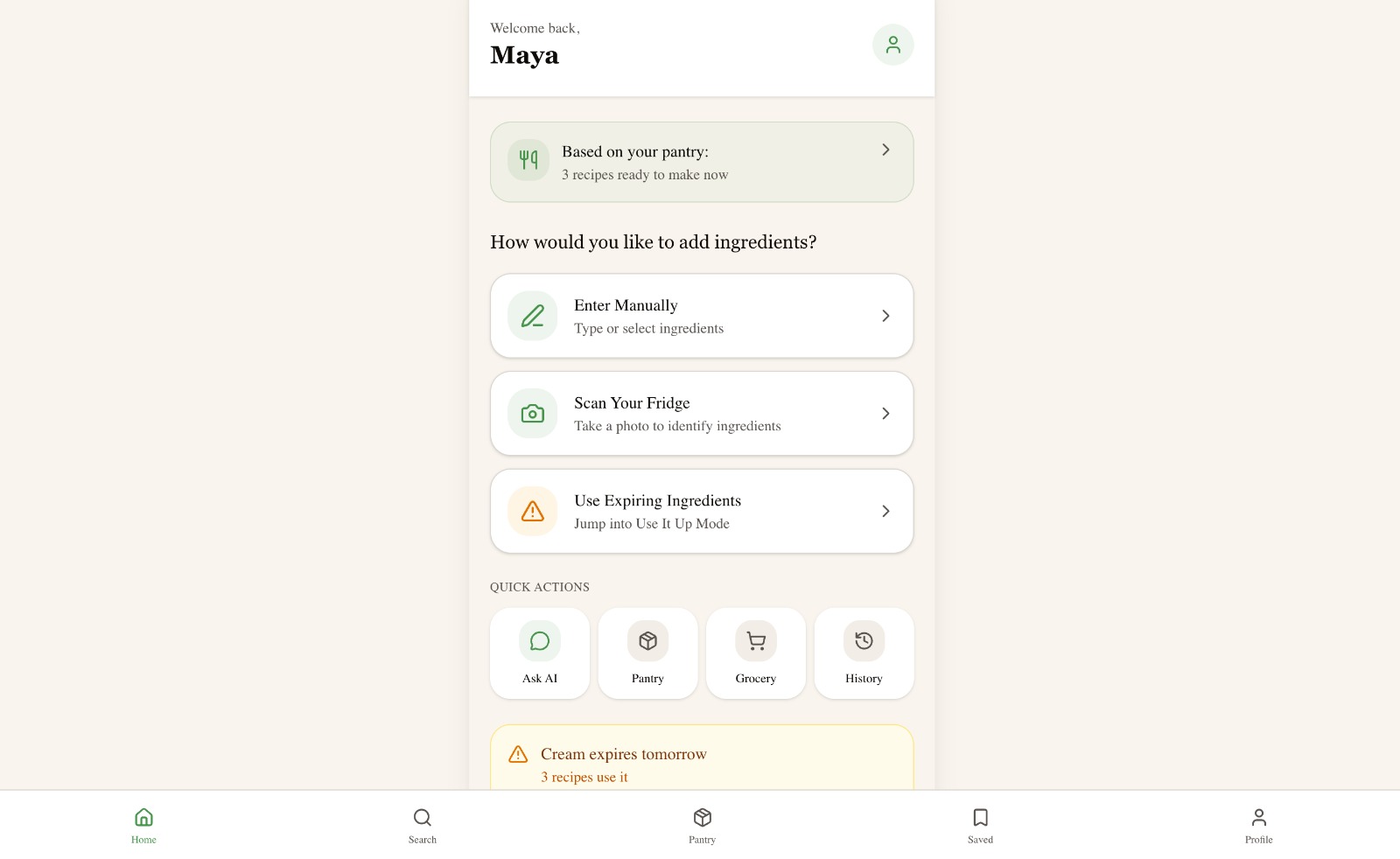
HomeThree entry points: enter, scan, or rescue.ScanFrame the fridge; QuickBite detects items and freshness.Add manuallyCategorized chips speed up entry when scanning isn't useful.ConfirmThe match preview rewards careful entry before the user commits.
C.
Meal recommendation flow
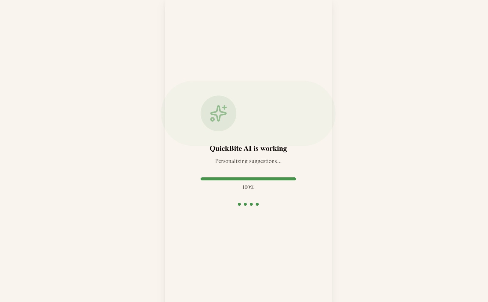
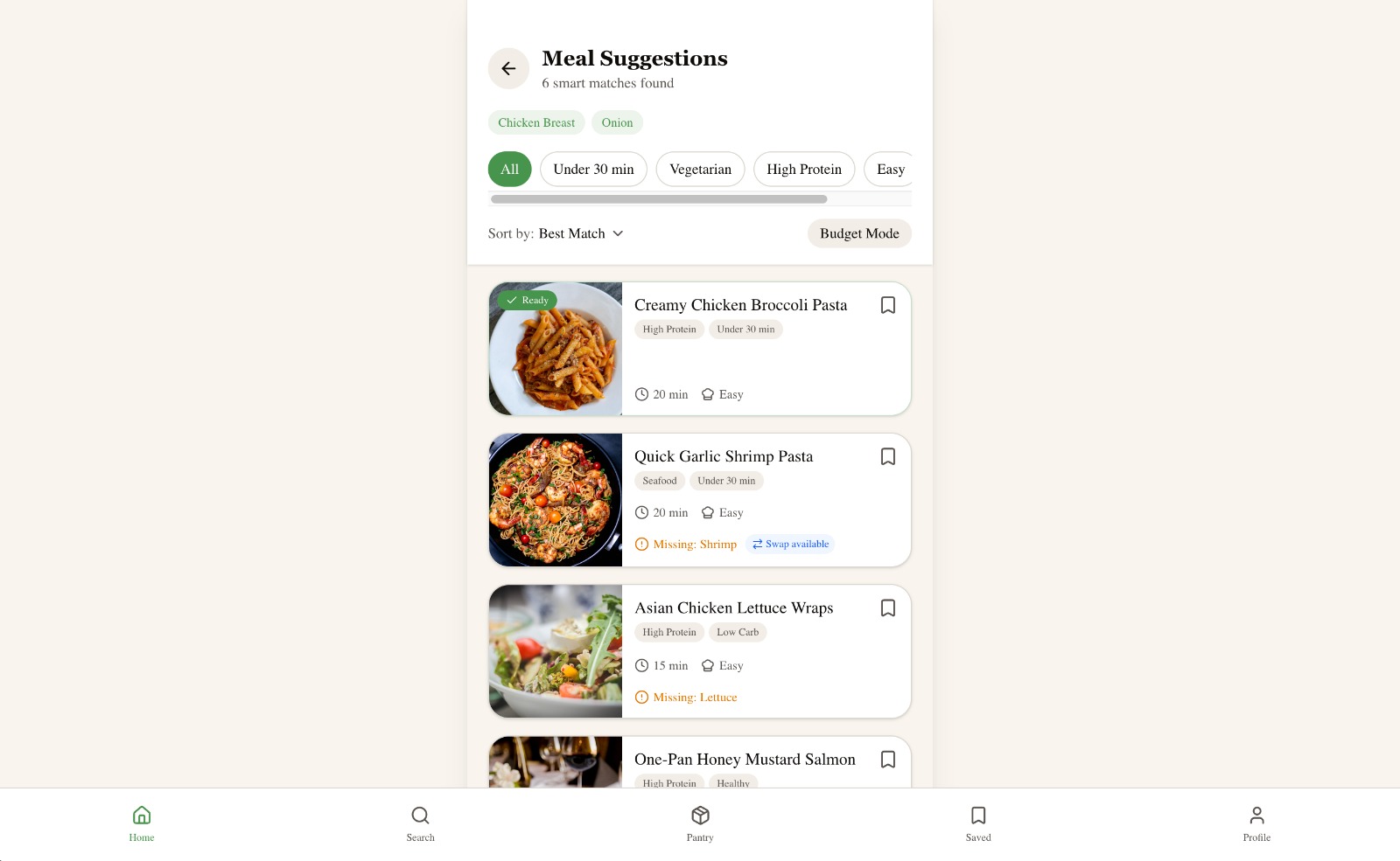
Recommendations are designed to explain, not just suggest. Each card shows ready status, match percentage, what's missing, and whether substitutions are possible.
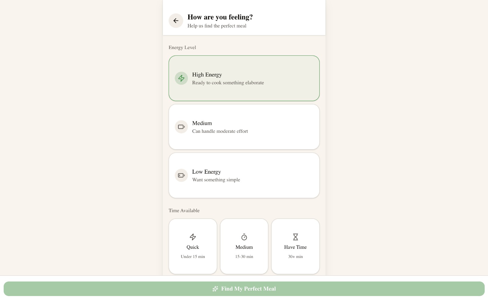
AI workingA short, honest loading moment.SuggestionsReady / missing / swap-available are first-class signals.Mood + timeThe same pantry suggests different meals on a tired Tuesday vs a relaxed Sunday.
D.
Food waste reduction flow
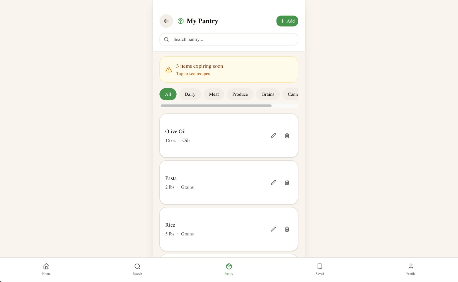
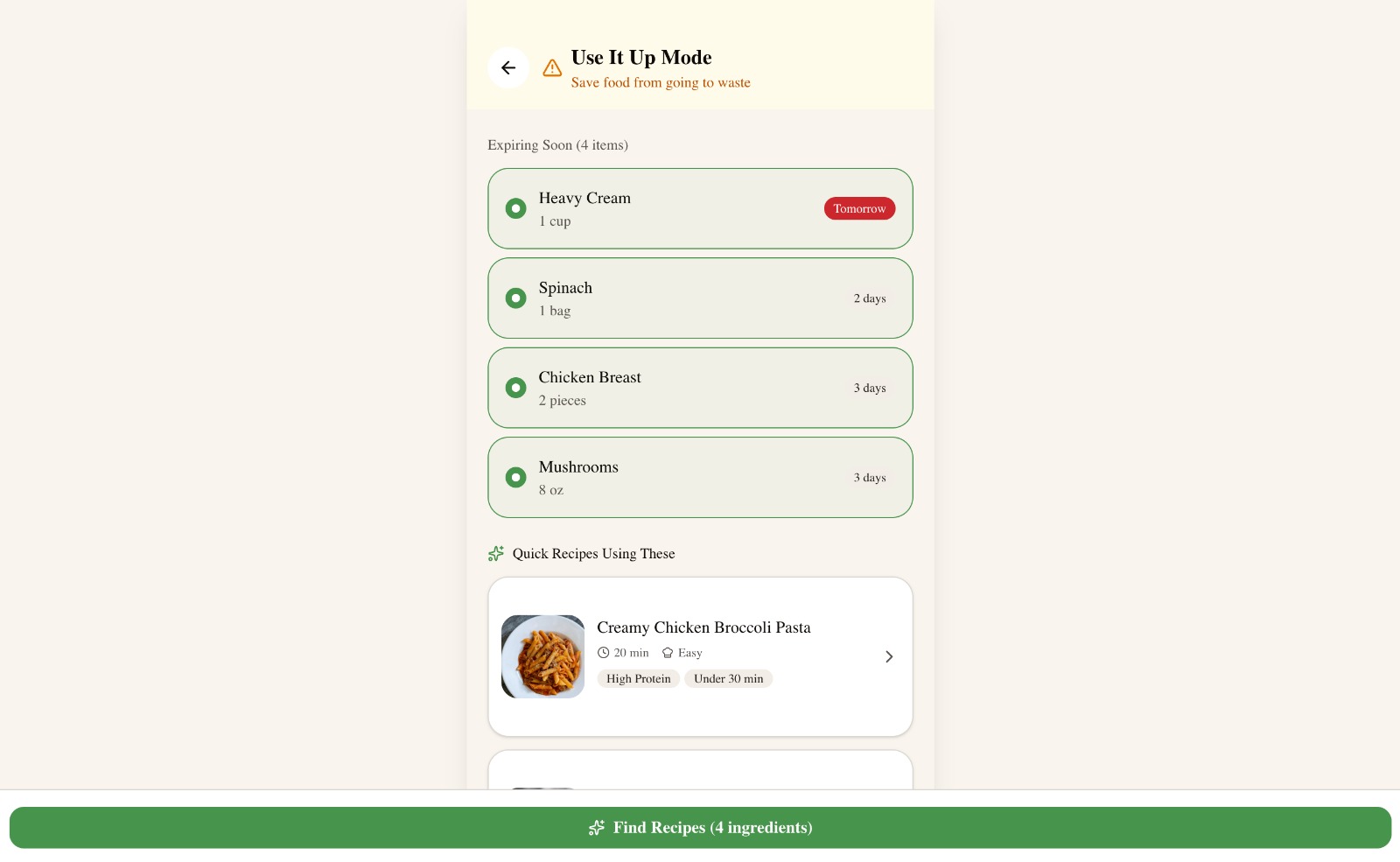
Rescue Mode shifted the framing from "what can I cook?" to "what should I use before it goes bad?" — connecting meal planning to a measurable household outcome.
PantryA persistent picture of what you actually have.Use It Up ModeExpiring items get top billing in recommendations.
E.
Support features
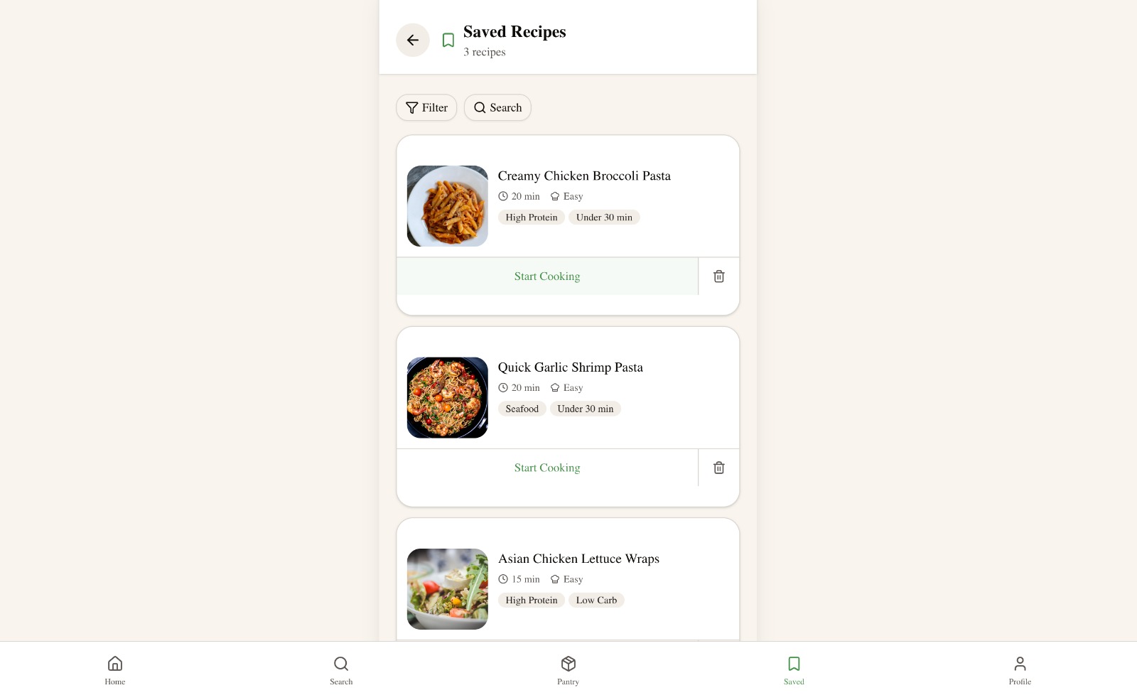
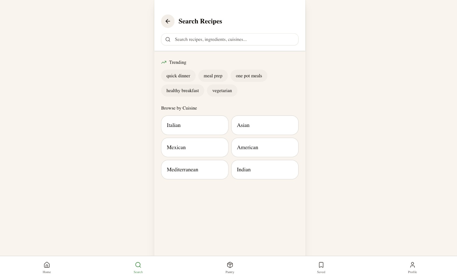
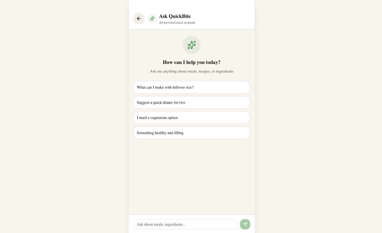
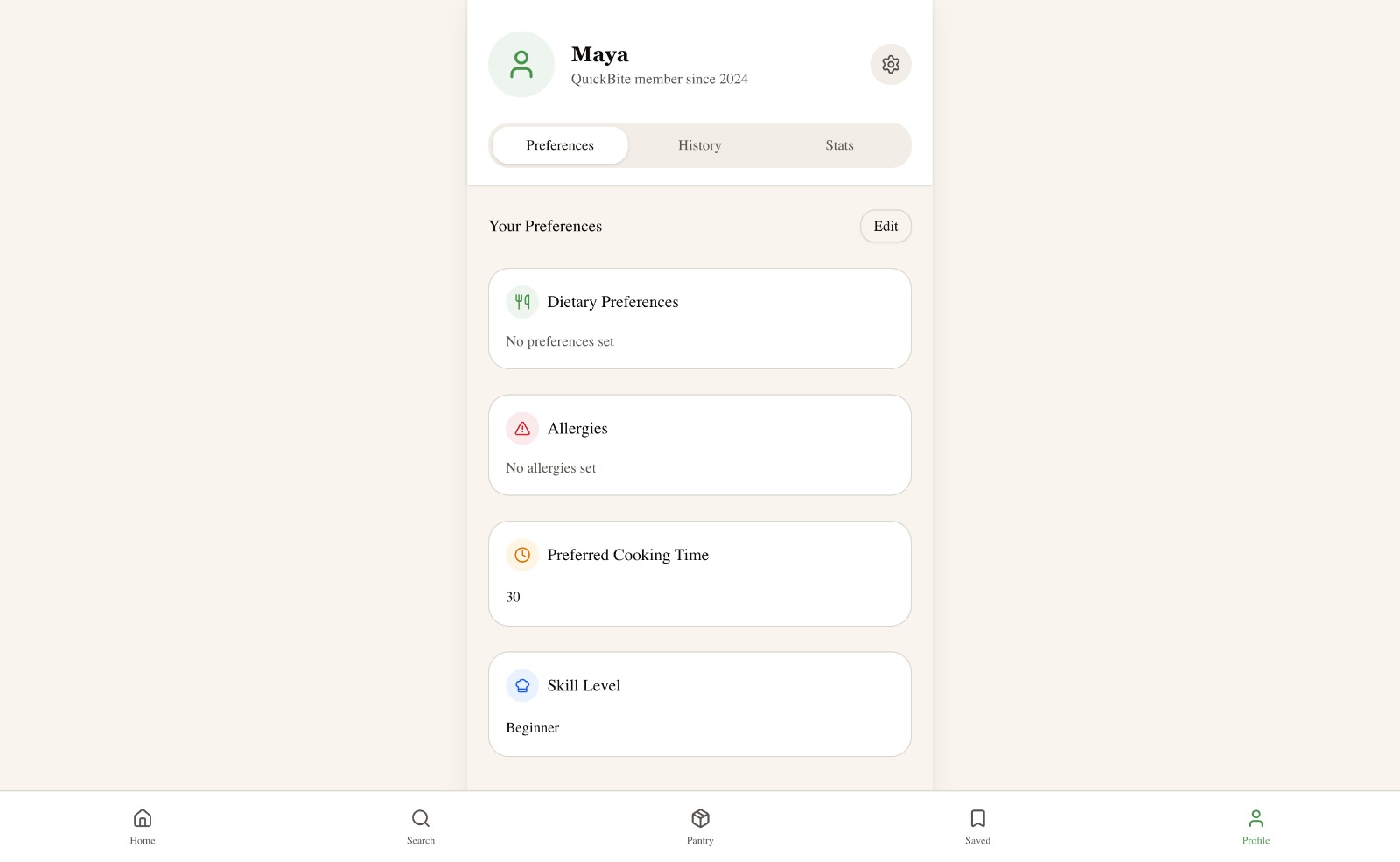
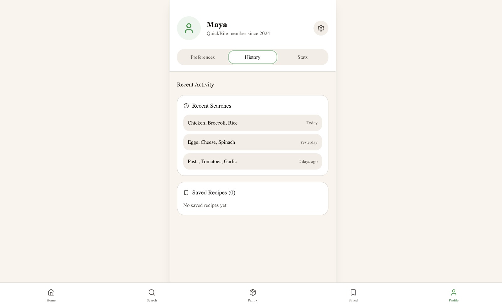
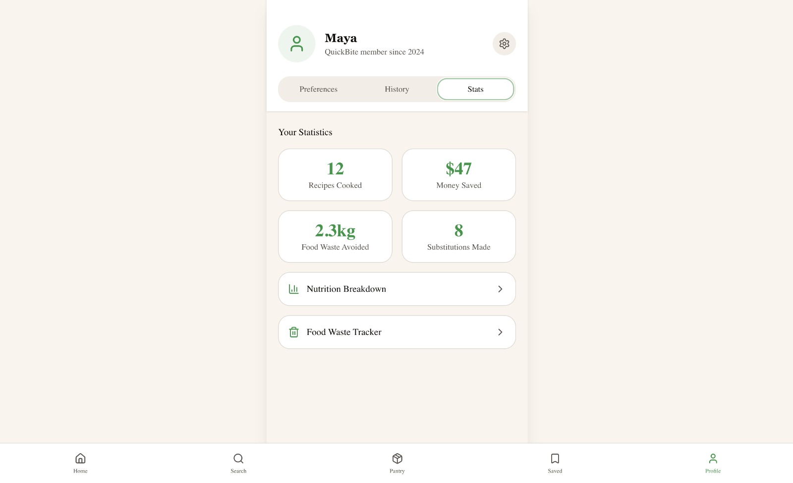
The pieces that make QuickBite useful past one meal: saved recipes, search by cuisine, the conversational AI assistant, and a profile that converts cooking into long-term feedback (money saved, waste avoided).
SavedOne tap to return to what worked.SearchBrowse by mood, time, or cuisine.Ask QuickBiteConversational fallback for off-menu questions.Profile · PreferencesEditable constraints that drive every recommendation.Profile · HistoryRecent searches and saves.Profile · StatsLong-term impact reinforces the habit.
§ 09 — Evaluation
Testing the result
Wizard of Oz, usability testing, journey mapping, heuristic review.
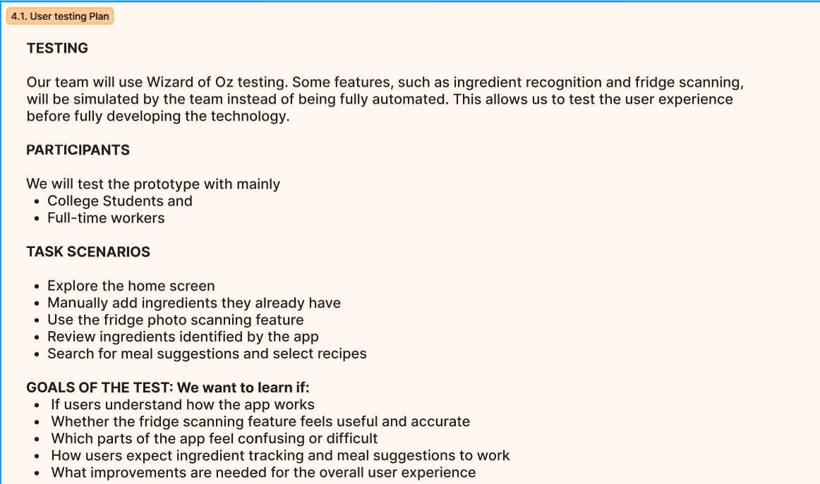
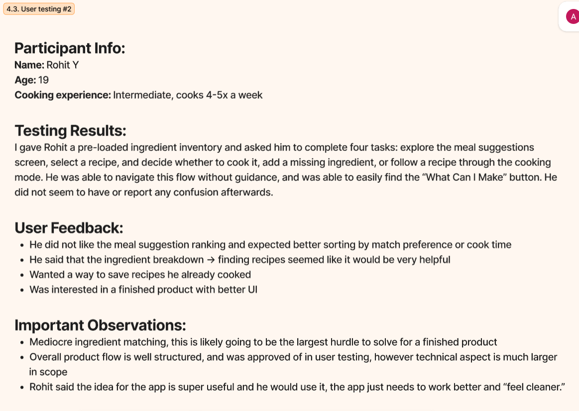
We used a layered evaluation: Wizard of Oz testing for the not-yet-built scanning feature, structured task-based usability sessions for the prototype flow, and a heuristic review against Nielsen-style principles. Participants included college students and one full-time worker; the lead session was with Rohit, age 19, intermediate cook, who cooks 4–5 times per week.
Tasks tested
Explore the home screen
Manually add ingredients
Use the fridge scanning feature
Review detected ingredients
Select a recipe
Navigate the cooking / recommendation flow
Findings
What worked
Users immediately understood the ingredient-to-recipe flow without guidance.
Ingredient breakdown and match percentages were called out as genuinely useful.
The "What Can I Make?" concept landed as a product idea worth using.
Saving recipes for later was a clear request — and it shipped.
Overall flow was judged "well structured" in Rohit's session.
What needed improvement
Ingredient recognition accuracy is the biggest technical risk and would hurt trust if shipped naive.
Users wanted clearer ranking — by match percentage or by cook time, not just "Best Match."
The scan flow needed explicit confirmation feedback before recipes appeared.
The ingredient selection page felt cluttered when many items were displayed at once.
How the pantry updates after cooking was unclear.
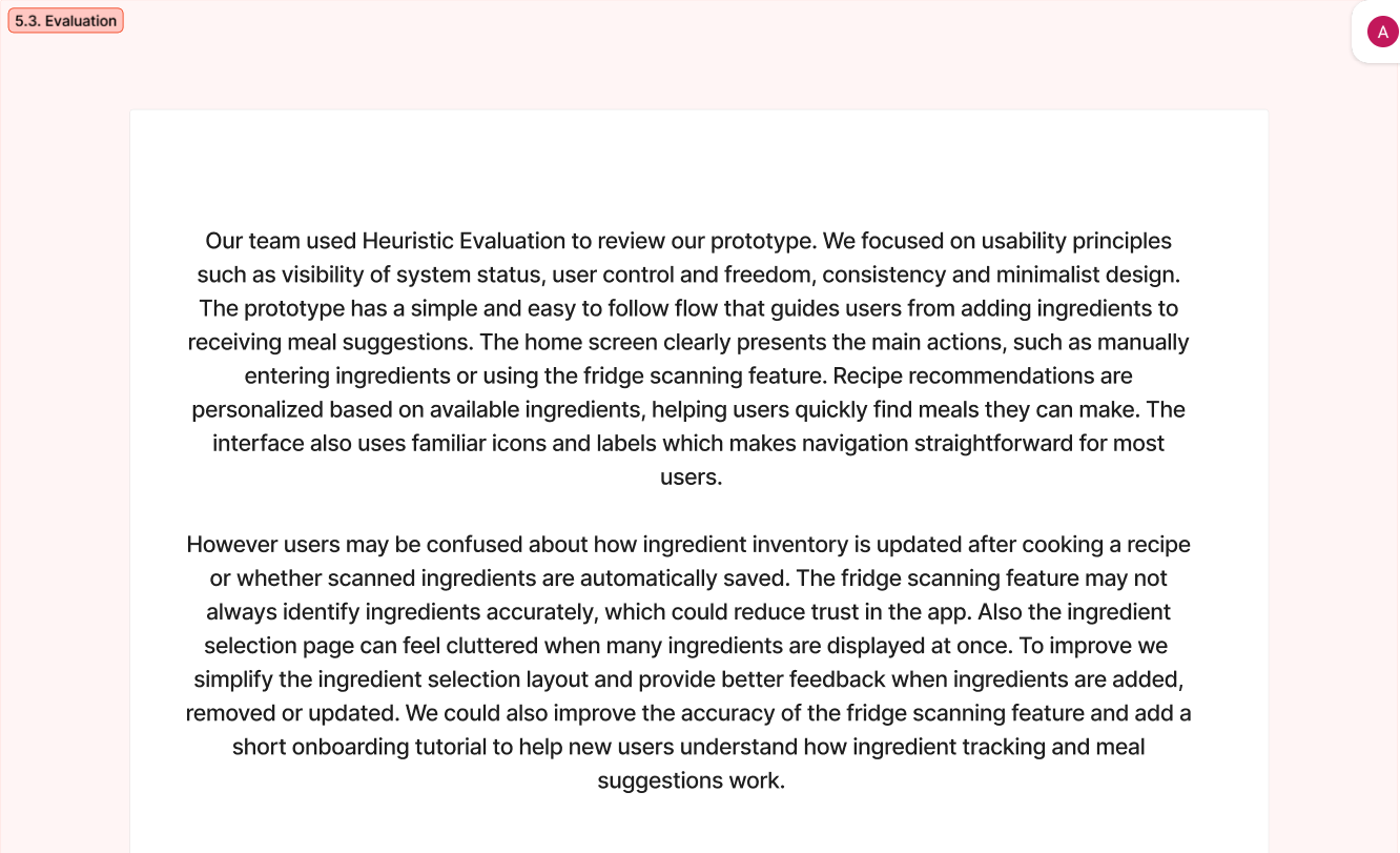
User testing plan. Wizard of Oz was the right method for testing the scanning experience before building a CV pipeline — it isolates the UX question from the ML question.User testing #2 — Rohit. The strongest single takeaway: "The idea is super useful and I would use it; the app just needs to work better and feel cleaner."Heuristic evaluation. Strong on familiar icons and a clear flow; weaker on system-status feedback for pantry updates and clutter when many ingredients are visible.
Design changes that came directly from evaluation
Change
Why
Added an explicit scan-review step
Users distrusted the silent auto-detection. Confirmation builds trust before recipes appear.
Surfaced match percentages and "why recommended" logic
Rohit explicitly asked for better ranking and reasoning behind suggestions.
Strengthened Rescue Mode for expiring ingredients
The pantry warning and Use It Up Mode became primary actions, not buried features.
Added grocery list support for missing items
Closed the loop between "what's missing" and "what to buy."
Expanded recipe detail with steps, substitutions, nutrition
Heuristic review flagged thin recipe pages and unclear substitution affordances.
Reorganized the home screen around scan + rescue
The two highest-impact entry points are now first and most visible.
§ 10 — Design rationale
Why these decisions?
Five choices that defined the final product.
01
Ingredient-first, not recipe-first
Why Research showed users usually have ingredients but no idea what to make. The decision happens in the kitchen, not on the recipe site.
Result The app opens with three ingredient entry points — scan, manual, rescue — before any recipe is shown.
02
Scan plus manual entry
Why Scanning reduces friction but recognition can be wrong. Removing user control would break trust the moment the model misfires.
Result Every scan is followed by a review screen where the user can correct or add items before the AI proceeds.
03
Specificity over generic AI
Why Generic suggestions ignore the real cooking variables — time, skill, equipment, dietary needs, mood — all of which research surfaced as decisive.
Result A mood + time picker, an explicit skill / equipment onboarding, and dietary filters all feed the recommendation engine.
04
Explainable recommendations
Why Users trust suggestions more when they understand the reasoning. Rohit said the ingredient → recipe link "seemed very helpful" when made visible.
Result Each meal card surfaces match percentage, "ready now" status, what's missing, and available swaps — never a black box.
05
Rescue Mode as a primary action
Why Food waste was a meaningful part of the problem space and a real product differentiator. Competitive analysis showed no app made it first-class.
Result The pantry warns about expiring items; Use It Up Mode promotes recipes that consume them; the profile tracks waste avoided in kilograms.
§ 11 — Reflection
What changed in our thinking?
The biggest shift was about what design even is.
A design process isn't about adding more features. It's about making better decisions, faster, and being honest about what to cut.
About design thinking
We learned how to narrow a vague problem into a specific design question — and how that narrowing, done well, makes every later decision easier.
How the idea evolved
QuickBite started life as a general meal-planning app. Through research and prioritization, it became an ingredient-first, context-aware decision assistant. The pivot wasn't dramatic — it was a slow tightening.
Biggest insight
Specificity matters more than capability. A small, opinionated feature like Rescue Mode communicated more about QuickBite's point of view than any general recipe browser ever could.
Team challenge
The hardest team conversations were about cutting features. The prioritization matrix wasn't just a tool — it was the artifact we kept returning to whenever scope tried to creep back in.
What we'd improve
More testing with beginner cooks specifically, real computer-vision pipeline for scanning, better post-cook pantry updates, push notifications for expiring food, and stronger recipe ranking.
What the project taught us
Design maturity looks less like clever features and more like restraint — building exactly what the design question demands, and consciously deferring the rest with a written rationale.
§ 12 — Limitations & future
Where the design ends — and what's next
An honest accounting of where the prototype falls short.
Limitations
Fridge scanning is simulated, not powered by a real computer-vision pipeline.
Recipe matching is simplified; production-grade ranking would need a real engine.
Pantry tracking depends on the user keeping data up to date.
Allergy filtering would need stronger validation before being safety-critical.
Nutrition and "money saved" figures are estimates, not audited values.
AI features assume a secure backend that doesn't exist yet.
Future plan
Real computer-vision ingredient recognition and freshness estimation.
Receipt + barcode scanning to auto-populate the pantry.
Pantry auto-decrement after a recipe is cooked.
Stronger ranking algorithm with personal learning loop.
Step-by-step cooking mode with timers and hands-free voice.
Push notifications for expiring food.
Privacy controls for fridge images and dietary data.
More usability testing with students, workers, and beginner cooks.
§ 13 — References
Sources & supporting research
Academic sources that grounded the user research.
Mills, S., et al. (2017). Home-prepared food, dietary quality and socio-demographic factors: a cross-sectional analysis of the UK National Diet and Nutrition Survey 2008–16. International Journal of Behavioral Nutrition and Physical Activity.
Taillie, L. S. (2018). Who's cooking? Trends in US home food preparation by gender, education, and race/ethnicity from 2003 to 2016. Nutrition Journal.
Farmer, N., et al. (2021). The impact of a culinary coaching telemedicine program on home cooking and emotional well-being during the COVID-19 pandemic. Nutrients.
Soliah, L., et al. (2012). Using food to reduce stress: Effects of choosing meal components and preparing a meal. Food Quality and Preference.
Pereira-Doel, P., et al. (2021). Enhancing well-being through food: A conversational agent for mindful eating and living. ACM Conference on Conversational User Interfaces.
El Zein, A., et al. (2018). Home-prepared meals among college students at-risk for food insecurity: A mixed-methods study. Journal of Nutrition Education and Behavior.
Nielsen, J. (1994). 10 usability heuristics for user interface design. Nielsen Norman Group.
SuperCook. (n.d.). SuperCook — recipe search by ingredients. supercook.com